
Just Enough Data Viz for Data Professionals
Master the 20% of Techniques That Drive 80% of Dashboard Impact


Imagine you’re planning to work in Data Analytics or are just starting out with data and have no idea what data visualization is or why it’s important. In this blog post, we’ll cover the top 20% of knowledge that addresses 80% of common use cases and interview questions. I’ve invited an expert in this field, Anastasiya Kuznetsova, who has been building dashboards and writing about Data Visualization for the past decade.
In this article, she will cover the foundational knowledge of data visualization, helping you avoid common mistakes and set high standards for data communication with your stakeholders.
Why Data Visualization Matters
Before diving into techniques, let’s start with why visualization is so essential. Data visualization bridges the gap between complex data and comprehensible insight. It helps you see what you can't easily get from the numbers alone. With effective visualizations, you not only make sense of your data but also enable decision-makers to quickly grasp key points.
To highlight this Justin Matejka and George Fitzmaurice created a broader collection of datasets that show how data can produce strikingly different visuals while maintaining similar summary statistics. It was based on the original Anscombe’s Quartet visualizing the same issue.
Each dataset looks unique—whether it's a dinosaur shape or more conventional scatter plots—once graphed. This reinforces that statistics alone aren’t enough to fully understand data.

https://www.autodesk.com/research/publications/same-stats-different-graphs
Both datasets were developed to remind analysts that statistical analysis without visualization can miss critical nuances, patterns, or outliers. Visuals offer the opportunity to catch errors and unlock insights that numbers alone may obscure. That is why always start with visualizing you data.
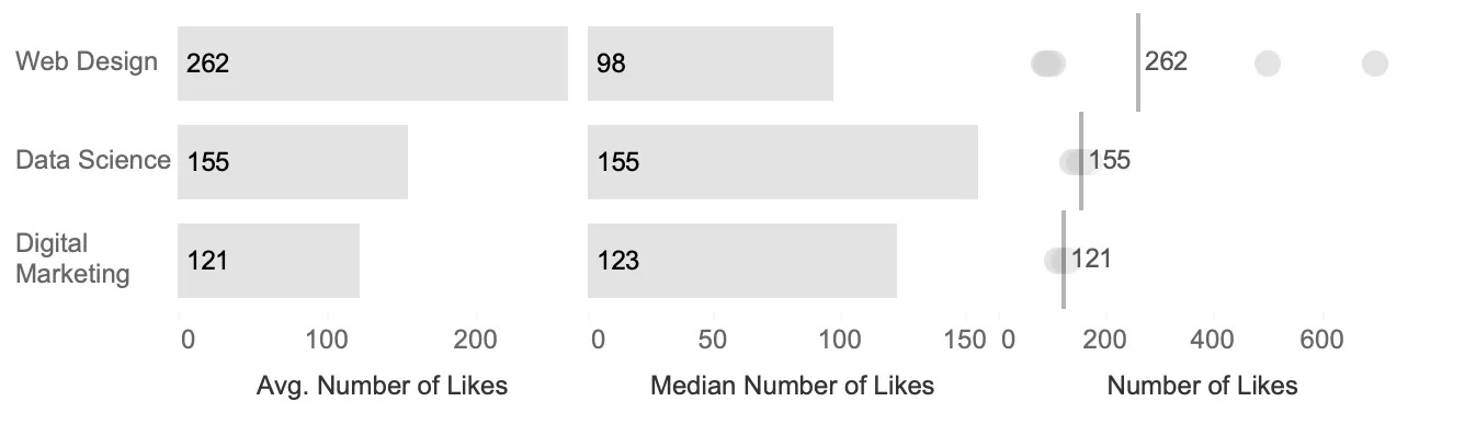
However it’s always better to try out different charts. I had a very interesting case long time ago where just relying on statistics wasn’t enough, and visualizing the data with a single chart wasn’t sufficient either. We were trying to analyze the results of different blog posts, and one of the metrics was the number of likes. While this use case is fabricated, it’s quite close to reality. As you can see, the average number of likes is higher for Web Design, and the median is higher for Data Science. However, there are two outlier posts in Web Design, which means most posts weren’t performing well, but these two were exceptionally popular. They turned out to be review posts that were indeed very popular. The takeaway is that if we had only relied on averages or medians, we would never have discovered these outliers.
How to choose the right chart
I hope that previous part made it clear that visualizing your data can help you with better understanding its specifics. Next step would be to lear a bit about the way to choose the chart type and how to work with them. I have a bigger article on that matter but I’ll just highlight the easiest and fastest ways to do so.
You cal always start by analyzing the data itself. A fantastic resource I often recommend is the "From Data to Viz" website. It allows you to explore various chart types based on the structure of your data (e.g., numerical, categorical, or hierarchical). While this approach might not offer the most advanced insights, it’s incredibly user-friendly and perfect for quickly narrowing down your charting options.
For example, geospatial data limits you to map-based visualizations, while time series data could lead you to line charts, area charts, or heatmaps. "From Data to Viz" helps guide these decisions by focusing on data types, which simplifies the selection process.

Beyond that, understanding your specific business or communication needs also matters. Charts like bar charts, line graphs, or scatter plots can highlight comparisons, trends, or relationships, while Sankey diagrams or tree maps are great for visualizing flows or hierarchical data. Remember, your goal is not just to plot data, but to create clarity and insight for your audience.
In most cases, you can rely on a handful of versatile chart types to handle common data visualization needs effectively:
Comparison: Use bar charts to answer questions like, "Which category has the highest sales?" Bar charts are simple but powerful for comparing data across categories.
Trends and Dynamics: For showing changes over time, the line chart is ideal. It helps answer questions like, "Is our sales growth increasing or decreasing over time?" This chart type excels in depicting continuous data and trends.
Part-to-Whole Relationships: Stacked charts, such as stacked bar or area charts, are useful for visualizing parts of a whole. For instance, "What percentage of total sales comes from this category?" These charts help highlight how individual components contribute to the overall total.
Relationships: Use a scatter plot to explore relationships between two variables, like "What is the relationship between sales and profit?" Scatter plots help reveal correlations and outliers in your data.
Distribution: To analyze how data is spread, try a histogram or jitter plot. These work well for answering questions like, "How is our customer lifetime value (LTV) distributed?" Histograms show the frequency of data points, while jitter plots handle overlapping data.
Quick Overview: For fast insights, KPI cards with small visualizations like sparklines provide a snapshot of key metrics, such as "What are our current sales?" These cards focus on giving at-a-glance performance indicators.
Exact Values: Tables are still the go-to choice for showing exact values, especially when combined with visual elements like heatmaps or small bar charts. Use them for questions like, "What were the exact sales numbers for this region and category?"
Flow: Sankey diagrams are excellent for visualizing flows and paths, such as "Which pages did users visit during their session?" They map the movement of data, users, or resources between stages.
You can also use chart choosers here. One of my favorite chart choosers – Visual Vocabulary by Financial Times

90% of tasks can be effectively solved using just bar charts and line charts. These two chart types are versatile, simple, and powerful tools for communicating data insights:
Bar charts are ideal for comparing categories, displaying rankings, and breaking down data into parts. Whether you're comparing sales performance across different regions or showing the distribution of categories, bar charts offer clarity and precision. Bar charts best practices.
Line charts excel at showing trends over time, helping to visualize how metrics such as revenue or website traffic fluctuate. Line charts are particularly effective when you want to track changes over continuous intervals, making them indispensable for dynamic time series analysis. **Line charts best practices.**
By focusing on these fundamental chart types, you can effectively address most analytical needs without overwhelming your audience with complex visuals. They're reliable, easy to interpret, and versatile enough to cover a wide range of data analysis tasks.
How not to mislead with charts
Once you've chosen the right chart type, it's crucial not to accidentally mislead your audience. Even well-intentioned visualizations can miscommunicate if not carefully designed. Here are some key guidelines to ensure your chart stays honest and clear:
Start the Y-axis at Zero
A common mistake is manipulating the Y-axis so it doesn’t start at zero, which can exaggerate differences between values. For example, a bar chart where the Y-axis starts at a higher number can make small changes seem dramatic. Keeping the axis for bar charts and area charts grounded at zero helps show true proportion.

Use Line Charts for Dynamic Data
Line charts are ideally suited for visualizing time-related data. The human mind instinctively connects data points in a line chart, following the gestalt principle of continuity. We perceive the lines as continuous, with a clear start and end, much like the passage of time. Attempting to create line charts from non-time dimensions may confuse users, as they naturally expect a dynamic sequence in these charts.

Adjust axes to convey a message
While it's important to keep axes honest, sometimes adjusting them can improve readability, particularly in specific chart types. In line charts or scatter plots, for example, it is often acceptable to omit a zero baseline for the Y-axis. The purpose of a line chart is typically to show the trend or direction of data over time rather than direct comparisons between values. Starting the axis at zero can flatten the line for some values, making it harder to discern trends. Data's message over strict adherence to conventions like a zero baseline.

Example with non-zero axis baseline
Avoid Using 3D Charts
3D visualizations, especially in bar and pie charts, often distort the perception of data, making it hard for the audience to accurately compare values. Stick with simple 2D designs to maintain clarity.
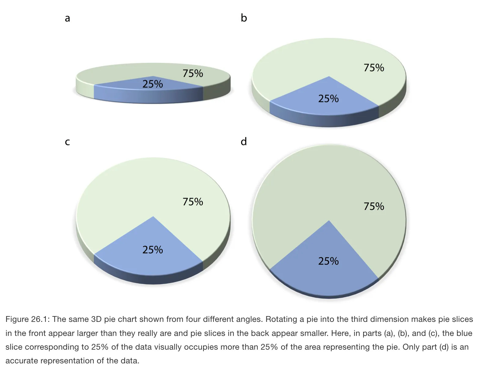
https://clauswilke.com/dataviz/no-3d.html
Maintain Proportionality in Visuals
Bubble charts can distort perception when not scaled properly – the area of the bubbles should correspond to the values being represented, not just the diameter. Misrepresenting proportions can skew how people understand the data.

From the book: “The Truthful Art” by Alberto Cairo
When working with stacked chart types, such as stacked bar charts or area charts, it’s essential to ensure that the stacked components add up to a meaningful total. For example, in financial or categorical comparisons, the total should represent a sum of all parts for a clear and accurate interpretation.
In pie charts and treemaps, where you're visualizing parts of a whole, the sum of all categories should always equal 100%. These charts are designed to represent proportions, and any deviation from this rule can mislead the viewer, suggesting false relationships between categories or overstating certain values.
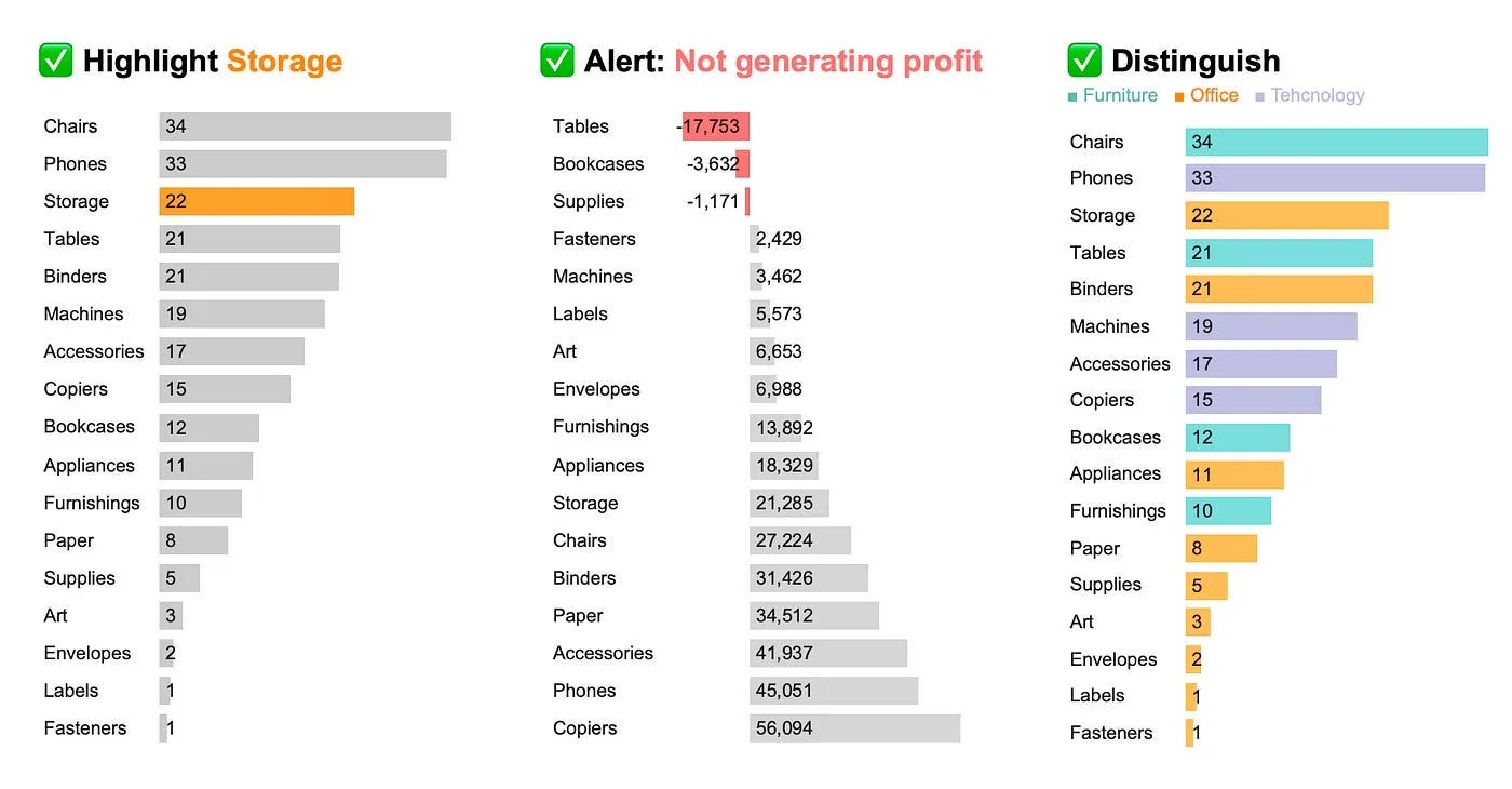
Limit Overuse of Colors
While color is useful for distinguishing data, overloading a chart with too many colors can make it confusing. Stick to a color scheme that helps clarify, not complicate, the data. Ensure your color choices are intuitive and accessible (consider colorblind-friendly palettes).
Use color efficiently:
highlight categories you are focused on
alert on changes and important information
distinguish other dimensions
All you need to know about colors in one place
Watch Out for Cherry-Picking Data
It’s tempting to only highlight the data that supports your narrative, but this can mislead your audience. Always aim to provide full context by showing all relevant data or explaining why certain data points are excluded.
Also you need to critically examine the data presented in charts, as the data can often be misleading. First, check the source to determine if it's reliable and whether you can verify the data or replicate similar results. If the source is not provided, it's best to question the credibility of the chart.
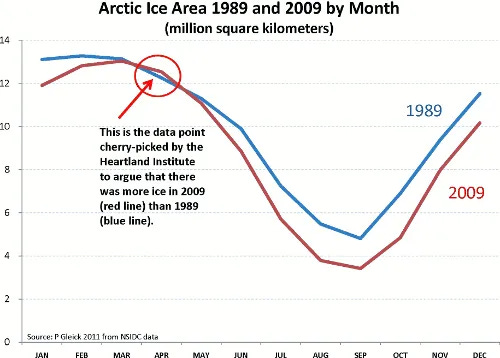
https://ourchangingclimate.wordpress.com/tag/cherry-picking/
Label Clearly
Make sure your axes, data points, and key elements are well-labeled. Misleading or missing labels can cause confusion, making it hard for your audience to interpret the chart correctly. Titles should also clearly describe what the chart represents.
By following these simple rules, you can ensure that your charts are not only accurate but also ethical in their presentation. Being mindful of these pitfalls will help you communicate data clearly and build trust with your audience.
Making a Dashboard
Once you've designed your charts, the next step is to combine them into a dashboard—a tool that brings together multiple visualizations in one place to provide an at-a-glance view of key insights. Dashboards are essential for data professionals, as they help in monitoring, analyzing, and exploring datasets effectively, offering a consolidated and interactive way to keep track of business metrics, performance, or any area where data plays a role.
A dashboard is a collection of charts, KPIs, and visual elements organized in a structured way to allow users to easily consume and interpret data. It can summarize complex information into simple, actionable insights for various audiences, from executives needing high-level overviews to analysts who require detailed data.
Dashboards serve multiple purposes:
Monitor: Track important metrics or KPIs in real-time or over time.
Analyze: Compare different data points to derive insights.
Explore: Allow users to drill into the data for more detail or investigate anomalies.
Combining Charts into a Dashboard
When combining individual charts into a dashboard, it’s crucial to maintain clarity and consistency. The principles of layout, chart selection, and design come into play to ensure users can effortlessly engage with the data.
By following the design rules discussed earlier—like considering scanning patterns, applying Gestalt principles, and maintaining a clean design—you’ll create a dashboard that not only looks good but also tells a compelling story with data.
Scanning patterns
Scanning patterns are crucial in data visualization and dashboard design because they dictate how users interact with visual information. Understanding these patterns allows us to arrange elements in a way that aligns with natural reading behaviors, ultimately enhancing comprehension and usability. Here are a few reasons why scanning patterns are important:


Gestalt principles
Gestalt principles are fundamental to understanding how people perceive visual information, and they play a crucial role in data visualization and design. Pretty much all you need from Gestalt principles are the proximity and similarity rules.
Proximity – when objects are in close proximity, our minds naturally infer a connection between them.
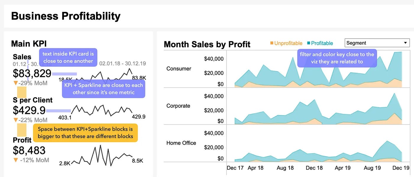
Place elements related to the same things together
Place filters and legends closer to the elements they are related to

Similarity – objects sharing the same color, shape, or size are perceived as related or part of the same group.
Effective color use
Consistent design of similar elements

Enclosure – this principle, akin to proximity, suggests that objects ‘enclosed’ within a defined area belong to a group.
Grouping connected charts with the same background, such as KPI cards.
Highlighting specific parts of the chart, such as predicted values or quadrants in the scatterplot.

Cleaner design
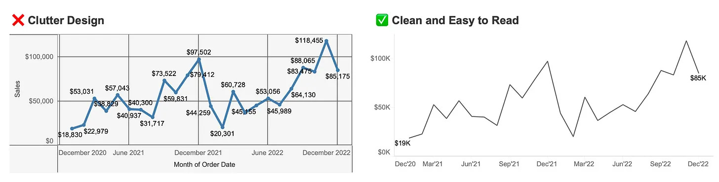
Remove clutter from your charts
Remove unnecessary elements from your chart that create noise and make it hard to read. If you are using Tableau, at least avoid adding new ones! The basic formatting is pretty good. Try to:
Remove borders
Remove gridlines (if they are needed, e.g., for large line charts, make them light grey)
Remove additional markers and unnecessary labels
Remove backgrounds
Also, take a look at a couple of makeovers on the Storytelling with Data blog. Most of the time, they focus on decluttering charts. Highly recommend!
Use Consistent Formatting
Consistency in colors, fonts, and styles helps in creating a cohesive look. Choose a color palette that aligns with your brand and use it consistently across different elements of the dashboard . Consistent formatting aids in quick comprehension and reduces cognitive load.

Utilize White Space
It's like pauses for your visualizations. There should be enough space between visualizations to take a breath and look at the next one 🌱
In Tableau, utilize paddings. Don't forget about inner padding; it helps make charts stand out from the background and creates the needed space.
Paddings (in px)
for charts: outer – 4, inner - 0;
for charts blocks: outer – 4–10, inner 8-16
between charts inside one block: 16-40

Don't overuse colors
Start with grey; make all charts grey! If you don't like grey, most likely you haven't found the grey you like :) There are many tones of it, so find the one you like and use it first. This will help you understand when you really need to use color.

Mastering data visualization and dashboard design is essential for data professionals aiming to communicate insights effectively. By understanding the principles of visual perception, selecting appropriate chart types, and adhering to design best practices, you can create impactful visualizations that facilitate informed decision-making.
Where to create your vizzes?
Code
Python: matplotlib, seaborn, plotnine, plotly. Check out python-graph-gallery.com to find code for needed charts
R: ggplot2, plotly. Check out r-graph-gallery.com
D3.js, d3-graph-gallery.com
BI tools (you can create a dashboard there as well)
Online tools
This is not a final list, and you can, of course, create charts in Excel or Google Sheets. The best way to start is by finding a topic that interests you and diving into it. Choose something you're genuinely curious about—whether it's sports, a favorite band, or a personal event—and pull some personal data to explore and visualize.
Book Recommendations
There are hundreds of books in this area but some books are better than others. Let’s share our picks of the books.
From Surfalytics by Dmitry Anoshin
Information Dashboard Design: Displaying Data for At-a-Glance Monitoring by Stephen Few - this book is vendor agnostic and explains details for the quality dashboard design.
The Big Book of Dashboards: Visualizing Your Data Using Real-World Business Scenarios by by Steve Wexler, Jeffrey Shaffer, Andy Cotgreave - this book has around 20 real dashboards built in Tableau for different industries and authors explain the best practices and improving dashboards while we are reading.
Lean Analytics: Use Data to Build a Better Startup Faster - this is not about data visualisation but it is about right metrics, the things that matter the most. This book will help you to learn what is worth adding to the dashboard and how to define the right metrics.
From @Anastasiya Kuznetsova
Storytelling With Data by Cole Nussbaumer Knaflic – is an excellent book for anyone beginning their journey into data visualization. It covers essential concepts and offers practical guidance to help you create more effective and impactful visuals.
Fundamentals of Data Visualization by Claus O Wilke – is a free e-book focused on helping scientists create better charts. The entire workbook is written in R Markdown, making it a practical guide for understanding useful concepts and improving data visualization skills. It serves as a valuable resource for anyone looking to enhance their ability to build effective visualizations in R.
How Charts Lie: Getting Smarter about Visual Information by Alberto Cairo – this is definitely one of my favorite books. It highlights the importance of thinking critically about how and why we create charts. The book is easy to read and filled with fascinating examples, making it both engaging and informative for anyone looking to improve their data literacy.
To further enhance your knowledge in this field, consider exploring works by Edward Tufte, Alberto Cairo, Stephen Few, Cole Nussbaumer Knaflic, Tamara Munzner, Claus Wilke and many others.
If you enjoyed this article, subscribe to our newsletters: BI Bites 🍪 and Surfalytics 🚀
 | A guest post by
|